Choosing the right colors for your home isn’t just about style—it’s about how you want to feel in your space. If you’re searching for ways to create a calmer bedroom, a more energizing kitchen, or a welcoming living room, understanding color psychology in interiors can make all the difference. This article breaks down how specific hues influence mood, behavior, and perception, and how you can apply those insights intentionally in your own home.
We draw on established design principles, environmental psychology research, and insights commonly used by professional interior stylists to ensure the guidance here is both inspiring and practical. You’ll learn which colors promote relaxation, which stimulate focus and creativity, and how lighting and room size affect the way shades are perceived.
By the end, you’ll have clear, actionable ideas to confidently choose color palettes that enhance daily living and reflect the atmosphere you want to create.
The Power of Intentional Color
Choosing a paint color is often the most impactful yet daunting decision in home design. The wrong shade can make a room feel cramped, cold, or chaotic, while the right one turns it into a sanctuary. To avoid regret, start with color psychology in interiors: blues calm, greens restore, yellows energize. If a space feels small, opt for LIGHT neutrals to reflect brightness and expand perception. Crave drama? Add deep accents sparingly for contrast without overwhelm. Test swatches at different times of day before committing—PRO TIP: observe undertones in light. Your home should FEEL intentional.
The Psychology of Color: Setting the Tone in Every Room
Color psychology is more than a design trend; it’s the study of how hues influence human emotion and behavior. Designers often Use color psychology in interiors as a foundational tool because color silently shapes how a space feels (even before you notice the sofa). Think of it as mood-setting without saying a word.
Warm Colors (Reds, Oranges, Yellows)
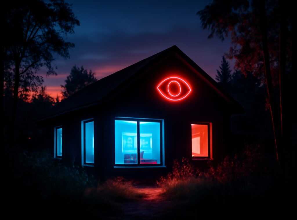
Warm tones are linked to energy, sociability, and even appetite stimulation. Red can raise heart rates, while yellow often evokes optimism and warmth (which explains fast-food branding choices, according to research published in Management Decision). These shades work beautifully in dining rooms, kitchens, and entryways where vibrancy and conversation matter most. Expect future trends to lean toward softened terracottas and buttery yellows as homeowners seek energetic yet grounded spaces—this is speculation, but current showroom palettes suggest it.
Cool Colors (Blues, Greens, Purples)
Cool hues promote calmness, focus, and serenity. Studies in Color Research & Application associate blue environments with increased productivity and relaxation. Bedrooms, bathrooms, and home offices benefit from these tones, creating restorative retreats. We may see deeper forest greens and muted lavenders rise in popularity as people prioritize mental wellness at home (a likely evolution, given wellness-driven design forecasts).
Neutrals (Grays, Beiges, Whites)
Neutrals provide sophisticated, flexible backdrops. They unify design elements and let art or statement furniture shine. As minimalism evolves, expect warmer whites and layered beiges to replace cooler grays—because “clean” no longer has to mean cold.
Beyond Aesthetics: Using Color to Manipulate Space and Light

Color isn’t just decoration—it’s a spatial tool. When used strategically, it can stretch walls, lower ceilings, soften harsh light, or dial up intimacy. The real benefit? You gain control over how a room feels, not just how it looks.
Making a Small Room Feel Larger
If you want walls to visually “recede” (appear farther away than they are), reach for light, cool tones like soft blues, pale grays, and off-whites. Cool colors tend to reflect more light, creating an airy effect that tricks the eye into perceiving depth.
For an even bigger payoff, paint the trim and ceiling the same color as the walls. Removing contrast erases visual boundaries, so the eye travels smoothly around the room (no harsh stops). The result? A compact space that feels open and cohesive.
Pro tip: Choose an eggshell or satin finish to subtly bounce natural light and amplify the spacious effect.
Making a Large Room Feel Cozier
Big rooms can feel cavernous. Warm, dark, or saturated shades—think charcoal gray, deep navy, or terracotta—make walls “advance” (appear closer). This creates intimacy and comfort, especially in living rooms or bedrooms where connection matters.
The advantage is emotional as much as visual. Rich tones absorb excess light, reduce echoing brightness, and make gatherings feel more inviting (no one wants to chat in a room that feels like an airport lounge).
Working with Natural Light
Light and finish matter as much as hue:
- Satin/Eggshell: Reflect light, brightening dim areas
- Matte: Absorb light for a softer, uniform look
- Lighter shades: Enhance daylight
- Darker shades: Control glare in sun-drenched rooms
Understanding color psychology in interiors helps you predict how these choices affect mood and perception—so you design with intention.
Creating Drama in Low-Light Spaces
It’s tempting to paint dark rooms white. But white can look flat or gray in low light. Instead, embrace moody jewel tones—emerald, sapphire, or plum. These hues create depth and sophistication, turning a shadowy space into a statement.
When paired thoughtfully—like when you’re mixing vintage and modern decor without clashing—color becomes your secret weapon for harmony and impact. The reward? A home that feels intentionally designed, not accidentally assembled.
From Theory to Practice: Building a Cohesive Color Palette
Design advice can feel abstract—until you need to pick actual paint. That’s where the 60-30-10 Rule comes in. This classic guideline suggests using 60% of a dominant color (usually walls), 30% as a secondary color (think sofas or curtains), and 10% as an accent (pillows, art, accessories). It’s not law, and I’ll admit some designers debate how strictly it should be followed. Still, as a starting framework, it prevents a room from feeling visually chaotic (like a paint store exploded).
Next, find your anchor piece—an item you already love. Maybe it’s a patterned rug, a bold artwork, or even a vintage quilt. Pull two or three colors directly from that piece and build around them. This approach feels cohesive because the palette already exists in harmony. If you’re unsure which shade to prioritize, start with the most neutral tone in the pattern and expand outward.
However, here’s where things get tricky: undertones. Undertones are the subtle hues beneath a main color—like a gray with blue or green hints. Clashing undertones can make a space feel “off,” even if you can’t explain why. I’ll be honest—this part isn’t always obvious without testing samples in your lighting.
Finally, create flow by repeating core colors from room to room. The shades don’t need to match perfectly, but they should relate. This continuity supports color psychology in interiors and helps your home feel intentional rather than pieced together. For deeper guidance, explore this home design guide.
Color is no longer just decoration; it’s a strategic tool for shaping how your home feels and functions. At first, choosing shades can feel overwhelming, but by applying principles of psychology, spatial perception, and balanced palettes, you create clarity. In fact, color psychology in interiors helps explain why soft blues calm bedrooms and warm neutrals ground living areas. So start small: choose one room, test swatches in morning and evening light, and adjust thoughtfully. Trust your instincts, because your space should reflect your lifestyle and personality. Ultimately, intentional color choices transform houses into homes that truly feel like yours today.
Bring Your Space to Life with Purpose and Style
You came here looking for clarity on how to transform your home into a space that feels cohesive, inspiring, and truly functional. Now you understand how thoughtful design choices, smart layouts, and color psychology in interiors work together to influence mood, productivity, and everyday comfort.
A home that feels chaotic, outdated, or uninspired can quietly drain your energy. The right adjustments—whether it’s refining your layout, selecting intentional color palettes, or optimizing daily living systems—can completely shift how you experience your space.
Don’t let frustration with your home linger any longer. Get expert-backed insights, practical styling guidance, and proven design strategies that turn ordinary rooms into intentional, beautiful environments. Explore more inspiration now and start creating a home that works for you—not against you.